
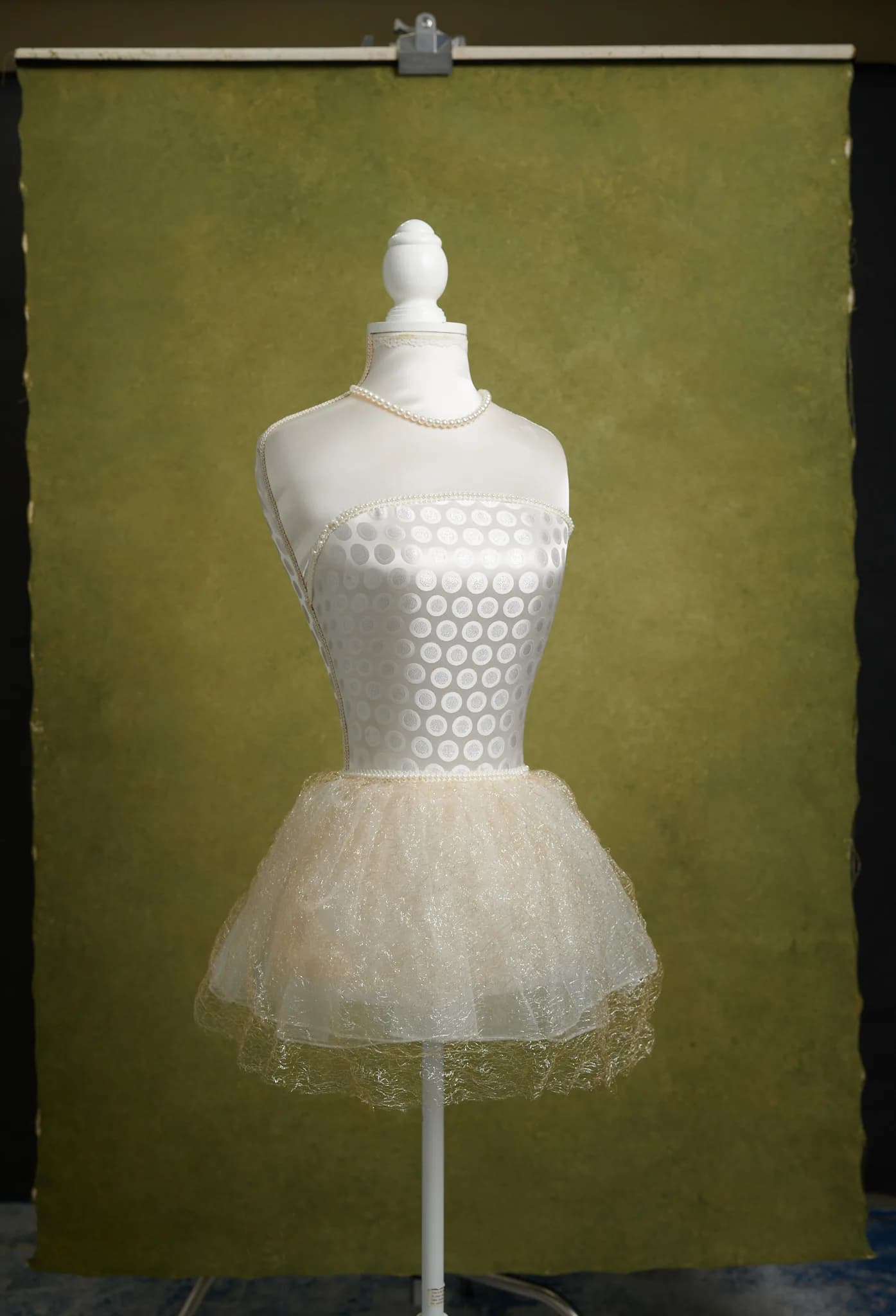
People usually come to green after a couple of years of grey, and fair enough. The trouble is that "green" covers a pale sage you'd paint a nursery in and a forest green that's basically black by the corners, and they don't do the same job at all. I mix the paint here, so I'm biased about canvas. The colour stuff holds whatever you shoot on though.
Olive, sage or forest: which green backdrop?
If I had to own one, I'd own an olive. There's enough brown and yellow in it that nobody's face goes grey-green in the shadow side, and I've yet to meet a skin tone it's unkind to. It also copes with a family of four who've ignored your wardrobe email. That's more or less why most of the green backdrops we've got in right now are olives, the small Olive Grove at 122 × 180 and a deeper dark olive at 180 × 270 among them.
Sage is the pale end of it. I'd reach for it with newborns or a soft maternity set, and I've not found a better friend for dusty pink yet. Small warning though: a light green throws a little of itself back at whoever's stood in front of it. Press someone right up to the canvas under a big light and pale skin can come out a bit minty. Bring them forward a metre and you'll barely see it.
Forest green I'd save for when you want mood. The unlit bits fall away to almost black, the lit bits go a deep bottle colour, and honestly I could look at it all day. It's a good call for headshots of people with warm or deeper skin. My guess is that a dark cool green just makes warm skin look warmer, but that's my guess, not science. One soft light, and take your time.
What to wear against a green backdrop
Clients never ask about this and always need it. Two approaches work, and they're opposites.
The first is contrast. Rust, copper, burgundy, mustard and warm cream all sit well on green. Red hair on olive is a classic for a reason, and so is a burgundy knit in front of forest green. You don't need a loud red, either. A muted terracotta does the same job and it's easier on the eye.
The other way in is tonal, and people don't believe me until they see it: dress the client in the backdrop's own green. My favourite example lately is a maternity portrait, olive satin dress on an olive canvas. Dress and wall almost vanish into each other, so all that's left for your eye is her skin and a lot of gold jewellery. Looks like a magazine. Oddly it's quite hard to mess up, provided the paint behind her isn't busy.
What doesn't work is bright green clothing on a different green. Lime against olive, or emerald against sage, and the two greens start arguing. I'd put that on the wardrobe note in plain words, because nobody guesses it.
How much texture on green?
To my eye green shows texture more readily than grey does, since the lighter and darker patches shift a little in hue as well as brightness. For full-length work, families and anything with plenty of wardrobe going on, I'd stay in medium and low texture. Save the stronger surfaces for head-and-shoulders portraits, where some movement in the paint gives a plain frame a bit of life.
Sizes, and when to have one painted
The 122 × 180 is enough for headshots and seated portraits. For a standing adult, or a maternity pose with a dress that moves, I'd go to 180 × 270 so the floor and the edges stay covered. Every size and what it costs is on the prices page.
If none of the greens in stock is quite the one in your head, I can paint one to order. Send a photo of the colour you're after and tell me who'll be standing in front of it and what they usually wear. That decides the green as much as any swatch does.