
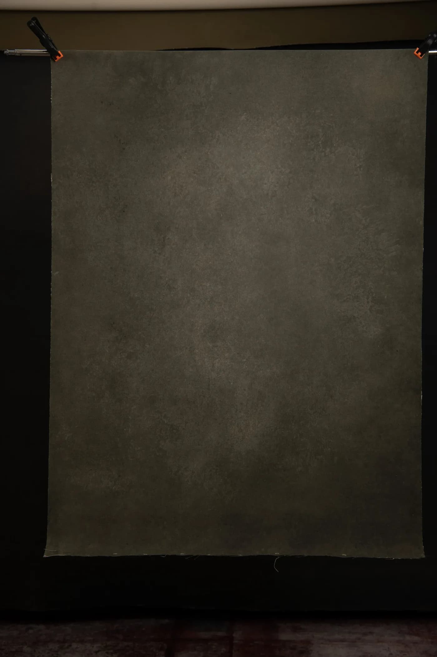
"Fine art" is doing a lot of work in backdrop listings these days. Search the term and you'll find everything from genuinely painterly canvases to a plain dark grey poly print with the words stapled on. So let me offer a painter's definition, since I spend my weeks making the things: a fine art backdrop is one that behaves like the ground of a painting rather than the wall of a room.
That means three observable qualities. The colour isn't uniform, it drifts through neighbouring tones so the background reads differently in different parts of the frame. The surface has some tooth to it, actual raised texture that catches light coming from the side. And the palette is muted, sitting behind skin tones rather than competing with them. None of this is mystical. You can check all three from a listing photo if you know to look, and if a "fine art" backdrop shows one flat repeated tone, someone is selling you an adjective.
Why painted grounds photograph differently
Portrait painters have primed and toned their canvases for centuries, and the reason translates directly to photography. A ground with subtle variation gives the eye something to rest on without giving it anything to read. Under a big frontal softbox, a painted canvas looks pleasingly soft. Move your key light round to 45 degrees or beyond and the texture starts throwing tiny highlights and shadows, and the background quietly turns three-dimensional. That change usually flatters the subject, though how strongly it shows depends on your light size and distance, so I'd always test rather than promise.
Choosing by mood
Colour does more for the mood of a fine art portrait than any other single decision, so choose the canvas the way you'd choose music for the session.
Grey is the working default, and I don't mean that as faint praise. A mid grey with warm undertones sits behind nearly every skin tone and wardrobe choice, which is why our grey shelf empties faster than any other. Something like this dramatic warm dark grey gives you the classic editorial look with no further decisions required.
For real weight, go darker. Charcoals and near-blacks like Dark Grey Charcoal or the rest of the darker shades pull the viewer straight to the face, Rembrandt-fashion. They want a bit more separation light behind the subject, or hair disappears into the void, which is either a problem or the entire point depending on the portrait.
Olives and muted greens are the quiet sophisticates. A canvas like Storm Olive flatters red hair and warm complexions particularly well, and the green and olive shelf has become the choice I see most among photographers who feel grey has been done to death.
Warm browns and rusts photograph like autumn feels. Autumn Palette carries blue and rust drifting through brown, and against it, cream and denim wardrobe choices come alive. Browse the brown and cream shelf with a client's outfit in mind rather than in the abstract.
A note on size
Fine art portraits are usually tighter crops, which is good news for your budget: a 100 × 135 cm canvas at £170 covers head-and-shoulders work happily, and 180 × 270 cm handles three-quarter lengths. You only need the big 270 cm widths when full-length or seated group work enters the brief. The full size ladder lays out what each step costs.
The honest summary: ignore the label, look for drifting tone, real texture and a muted palette, then pick the colour that matches the mood of the work. The label on the listing matters far less than what the cloth does under your light.